
Top 10 Website Features #5: A “Clean Well Lighted” Home Page
by Mark S. Burgess, Page Mountain LLC
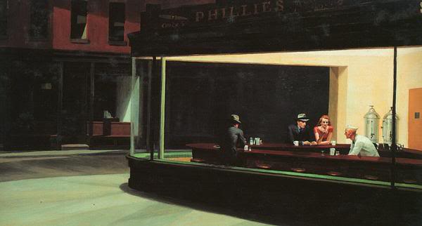
A clean, well-lighted cafe was a very different thing.
– Ernest Hemingway, “A Clean Well-lighted Place”
In Hemingway’s short story “A Clean, Well-lighted Place”, we listen in on three men in different stages of their lives from young to middle age to old. Hemingway’s sparse prose and clipped dialogue portray the café as one physical location representing a different experience for all three men.
So goes your home page. You likely serve more than one target audience but you only have the one site to do it with.
The series so far:
- Backup at the same frequency as changes
- Finding the Contact Us Button
- A responsive “mobile” design
- Website Logistics
- A “Clean Well Lighted” Home Page
First, let’s pull back for a second. This article focuses on your home page, but it’s really about your whole site as seen from the home page. A little considered fact is that most visitors to your site don’t arrive on your home page. Check your stats, you’ll see. The search engines and social links take them to deeper places within it – fewer than the home page but more in aggregate.
At best, 20-30% of a website’s traffic, enters the site through the home page. In the old days when direct navigation reigned and everyone typed domains into their browser address bar, that number was a lot higher. In these days of mobile devices surfing social networks and search engine deep links, most of your web site visitors won’t even see your home page.
The burden it carries remains, however. For the traffic that does come to your home page, you have the challenge that every retailer knows: you can’t know ahead of time who will come in the store, why they are there or what they are looking for with the added disadvantage online that you may never know.
Sure, you can guess. It’s unlikely that a male shops to buy in the bra inventory at nordstrom.com – but possible. That highlights one of the inherent flaws in the “You might also be interested in…” common ecommerce upsell strategy. Say I was in that bra section, getting a gift for my wife. The simple upsell rule is to match it with something people buy when they get the main item or that are similar to it. If the system knew I was a guy getting something for my wife – and it knows it’s me as I’m logged in – then it might still offer the follow up pairing as a good idea to add to my gift, but then it would show me the latest men’s shirt sale.
At best, 20-30% of a website’s traffic, enters the site through the home page.
The point is that every web site is a marketer and engineer’s combined prediction for how the visitor use it. We’re just tickling the edges of truly dynamic sites. Privacy concerns and the simple difficulty of accommodating human behavior delay the refinement.
If you follow some simple principles, you can present your best to the world:
Fast – since a dominant number of visitors to the home page are there because something pointed them to it without a specific mission for a particular item on your site, those visitors have the shortest patience: 4-5 seconds. If they can’t see the page – let alone figure out where to click what’s of interest to them – they’re gone – disappeared back into the visitor forest like a startled doe. Don’t load the site up with gigantic (meaning large download file size) graphics or forcing a video to load or putting everything your company ever offers or does on the home page. And, please don’t play any music or autoplay a video. Especially if you’re audience work in an office, no one wants the world to know what sites they visit and it slows the user in a lethal way to make them have to find and stop something from playing. Of course there are exceptions, when my company built Legoland California’s first website, we installed a game that squeaked with each move. I remember the day after being in the offices at Legoland and hearing the squeak from all over in the cubicles. That was good.
Clean – While Moore’s law properly describes the 18 month cycle for advancement in technology, the human eye doesn’t change. In order, we see: moving things, human faces, colors and objects – all grab our attention. Then we read. All that takes place in a few seconds, so don’t “bury the lead” and make your site visitors have to study your site – scrolling and scrolling – to figure out what to do. Use what you know about your market to present the most important items to you and to them in as compact, succinct and accessible arrangement as possible. First time site visitors don’t hunt – unless something outside of your home page prepared them to dig, and you can’t count on that.
Reputation works the same online as offline
Well-lighted – in Hemingway’s Café as applied to websites, the light is a metaphor for what is revealed to the reader. In the case of a website, the reader is both robotic and human. The search engines harvest your content for one purpose: to make it findable by someone looking for it. The very first step in Search Engine Optimization, is to make sure you help the search engines place you properly. Forget the “black hat” strategies of long lists of links to other sites, or overly repeating keywords, or trying to buy “backlinks” to build your reputation. Funny thing: just like the real world, if you have something interesting to say and you say it to be understood, your reputation will grow. Online, we measure that reputation in sales closed and relevant traffic numbers. And, like the real world, if you keep repeating yourself, don’t say what you mean and keep name dropping…your reputation drops.
In the end of Hemingway’s story, the older waiter has to explain to his younger co-worker about a core component of his cafe’s audience. Every site has an audience it serves better than anyone else if you make a presentation that audience recognizes and can easily engage them.