
Top 10 Web Site Features #3: A Responsive Mobile Design
by Mark S. Burgess, Page Mountain LLC
- Backup at the same frequency as changes
- A Contact Us form with multiple recipients
- A responsive “mobile” design
Responsive web design (RWD) is a web development approach that creates dynamic changes to the appearance of a website, depending on the screen size and orientation of the device being used to view it.
– Nielson Norman Group
(www.nngroup.com/articles/responsive-web-design-definition/)
 Once upon a time, if you were “Netscape compliant” then “Explorer compliant” at a resolution of 640×480, that’s all you need worry about as a designer. Nobody looked at web pages on a phone and if they did, as phones with browsers came on the market, all that was expected was text.
Now there is this maelstrom, the first wisps of which appear below – taken from a site I manage with significant traffic – of the Top 10 browser resolutions in use to view the site. Note that the most popular is a tiny 15% of the traffic….and there are 264 more different resolutions beyond this top 10!
- 768×1024 14.64%
- 320×568 14.61%
- 1366×768 9.94%
- 360×640 8.16%
- 1280×800 6.32%
- 1920×1080 6.24%
- 1440×900 4.51%
- 375×667 4.44%
- 320×480 3.74%
- 1600×900 3.32%
Is there any question your site should be responsive?
No.
So, not only should you be designing your site for mobile devices, you must also accommodate Chrome, Explorer, Firefox, Safari, Opera and hundreds of others (see http://en.wikipedia.org/wiki/List_of_web_browsers) on those devices. These browser software products run on IOS, Windows, Android, MacOS, Chrome OS, Windows Phone, Linux, Blackberry, Nintendo WII and what Google Stats refers to as “(not set)” for other platforms – all part of the gateway between your user and/or customer and your site.
Of course, you can always make the decision to simply not worry about the other browsers and tailor your web site “theflatearthsocietyandassociation.org” to 640×480….but would that be running on Windows or Mac? (If you reply, “why I want it through Lynx on BSD”, then you’re likely still trying to use GOPHER to roam the Internet or IRC to chat and stuck in 1994…)
For most, then, the question becomes, how hard do you want to work? And, not only now, but every week your site is live as new devices and software come on the market.
For the same reasons, I don’t have regular shipments to the foundry in my basement from a bauxite mine so I can smelt my own aluminum; and a microcircuit construction bench with a silk screen press where I can build my own circuit cards to mount in the aluminum cases I build with the cathode ray tubes I created in my glass forge so I can be writing machine code to build my next web site; I believe in “standing on the shoulders of giants,” as Einstein reported, to deploy cost effective and maintainable solutions for my customers.
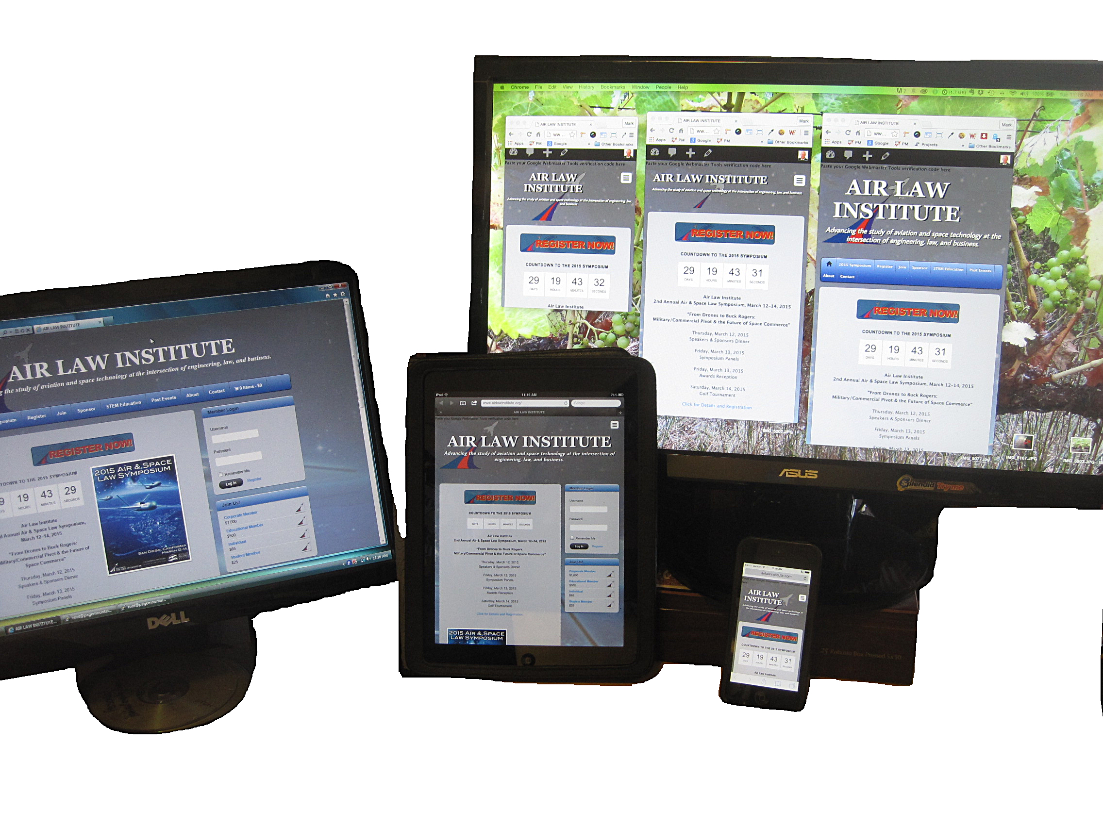
The Content Management Systems available (WordPress, Drupal, Joomla) have a forest of elves producing themes and templates that have responsive design built in. Even the .NET environment comes with built in mobile functionality when you construct a web base application. While nothing will ever fit all of the devices all of the time – the headline photo shows (excerpted at right) I hadn’t yet accommodated entirely the 540×960 Android screen so the menu wraps – you can satisfy the requirements of most and then chip away at the exceptions as needed. (In this case, it just takes a little bit of Cascading Style Sheet (CSS) code to fix the the problem.) Meanwhile, the template and theme authors will be keeping current so you don’t have to.
For most businesses requiring a web presence, a responsive web site should be accessible on most devices. For those who require tighter integration, then a native app written for IOS (Apple iPhone and iPad) and Android will be required…along with a fair amount of development investment depending on the application.